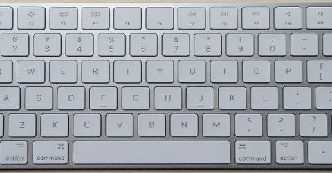
How did we end up with the QWERTY keyboard layout?

Typing is such an integral part of modern life that it’s become an automatic action.
Like other learned skills such as driving and tying shoelaces, we type almost instinctively.
That’s all the more impressive when you consider the layout of computer keyboards is almost comically unintuitive.
As easy as A, B C?
Logically, computer keyboards should be arranged in alphabetical order.
There’s no other situation where we approach the alphabet in a non-sequential order.
And early attempts at typewriters used a variety of letter layouts, laid out across balls, dials and piano-style rows.
However, an 1870s design by American sewing machine manufacturer E Remington & Sons would become the industry standard.
It featured four rows of alphanumeric characters, with numbers grouped along the top row.
Remington’s layout placed the M key after L, and transposed the C and X keys from today’s layout but otherwise, the key order has remained unchanged ever since.
This order was developed after it was noted the metal arms on each key jammed together if neighbouring ones were pressed.
It took the developers five years to find a key layout which they believed would minimise this occurrence.
Along the way, there were experiments with all the vowels and the letter Y (which is often used phonetically as a vowel) on one row, separated by punctuation symbols.
The finished patent had some letters in near-alphabetical order (DFGHJKL), with others positioned to minimise consecutive key presses (ZXCVBNM).
Remington chose to ignore other templates, such as the DHIATENSOR layout, which grouped together ten letters capable of spelling 70 per cent of English-language words.
Instead, they funded numerous touch-typing classes, effectively indoctrinating people into the QWERTY keyboard layout at the expense of rival options.
Flawed standard
The QWERTY keyboard layout has always suffered from several inherent design flaws.
The three most commonly-used letters (E, A and T) all have to be typed with the left hand, even though 90 per cent of people are more dextrous with their right hand.
Because only one of the English language’s five vowels appears on the keyboard’s central row, our fingers are constantly moving up and down as well as sideways.
And despite being designed to minimise common letter pairs like TH and ON, the QWERTY keyboard layout has positioned ER together.
The period symbol and the E key were swapped over shortly before the patent was filed for the finished keyboard design.
There are two possible explanations for a revision which seemingly undid years of attempts to minimise adjacent letter presses.
Firstly, people experimenting with this layout for the first time would have found it easier to type TYPEWRITER if every letter appeared on the same row.
Remington’s design could have failed, so perhaps this was a panicked attempt to simplify an otherwise wilfully complex key layout.
Alternatively, maybe it’s not a coincidence that the typewriter patent was filed by E Remington…


